APPROACH TO WEBSITE DESIGN

As a San Diego based organization, CPD has developed a successful approach to designing new websites for businesses large and small. Outlined here is the strategy that is used in website design, but also applies to services like internet marketing and corporate branding.

THE IMPORTANCE OF WEBSITE DESIGN

In today’s competitive web environment, having a website that is visually appealing is very important. Here is a few reasons why designing custom websites is so important:

  • Browser compatibility – your website needs to look the same in all web browsers and screen sizes.
  • Ease-of-use – a well designed website makes it very easy for users to navigate to the information they want.
  • SEO benefits – Search engines like Google are so advanced, that they can detect well designed websites and help improve their ranking.
  • Branding – Make the website a reflection of your business with a creative unique design.

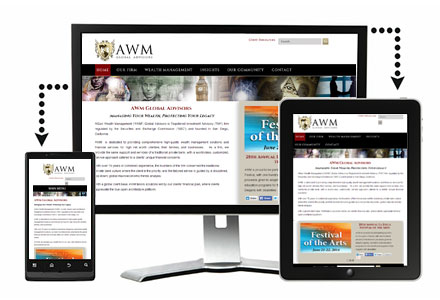
OUR PROCESS TO DESIGNING WEBSITES

CPD takes great pride in our ability to work with clients and produce high quality websites. A successful relationship between the designer and client always revolves around communication. From our San Diego offices, CPD is available to meet and discuss all web projects.

Identifying the needs of the client and helping to define the terms and technologies that are involved are an important first step in custom website design. It is critical that the client understand their own needs before depending upon a website design company to help them.

1. BRAINSTORMING SESSION
Learning about what your organization and how it differentiates itself from your industry helps generate ideas for your graphic art. If you have ideas based on other materials, we are interested in seeing them to help incorporate into your design.

2. CONCEPT GENERATION
A great way to get the ball rolling is to allow our design team to experiment with a few concepts based on our brainstorming meeting. The number of concepts is pre-determined in the quoting.

3. DESIGN DECISION
Choose a design or combination of designs that you like best. You can view concepts in a variety of ways. We can make them accessible through an online portal, email proofs, or copy proofs to a disk. Revision hours are built into your quote.

4. FINAL REVISIONS
We are not satisfied until you have the product you wanted. There are a minimum of two revision cycles for each project. Larger projects involve several rounds of communication. We are dedicated to helping you achieve your goals.

5. PUBLICATION
Upon finalizing a design we will provide several formats of the artwork based on your needs. Print formats as well as online publishing formats are commonly produced.

Responsive Web Design & Development

The Scenario

You’ve worked hard to design a new website layout that provides site visitors with engaging information and clear navigation. With each element in place, your new website design should provide ease-of-use and enhance your organization’s brand. But have you considered how this design would look on a tablet, e-reader, smartphone or other mobile device? These varying device resolutions are where responsive website design becomes very important.

Web Traffic by Device as of January 2015:

Desktops & Laptops 58%
Mobile Phones 27%
Tablets 15%

While office desktop PCs are still common, web browsing on tablets and mobile phones is on the rise. Many people browse the web on an iPad, Kindle, or smartphone. Therefore, if you don’t have a responsive, mobile-friendly website, you risk losing valuable traffic.

The Solution

A responsive website automatically adapts to the screen size of the device. When the website is viewed on different devices, the layout and website elements adjust to the fit of the screen. Here’s a good example of how a responsive website would look from a desktop browser, a tablet, and a smartphone:

responsive-website-design-and-development

And yet, these images are not three different websites. This example is one website that has the necessary HTML and CSS code to automatically adjust based on device screen resolution size.

Responsive Website Advantages

Keeping your organization up-to-date with technological advances is only one benefit of building a responsive website. A responsive website eliminates the need for separate website versions for desktop, tablet, and mobile phone layouts – so you end up saving money. Additionally, responsive websites are easy to maintain because they do not involve any server-side components.

From a search engine optimization (SEO) point of view, making your website responsive is beneficial because you’ll have just one URL. You won’t have to worry about some sites linking to your mobile website and some to the desktop version.

Additional responsive website benefits include:

  • Optimize user experience – Allow users to easily navigate the website and view content based on their screen resolutions (smartphone, tablet, laptop, desktop).
  • Save time and money – No need to have a separate mobile website, which then reduces costs and the amount of content you need to manage.
  • Improve search rankings – Major search engines look for websites that have responsive design as part of their search algorithms.